L O G O D E S I G N / B R A N D I N G
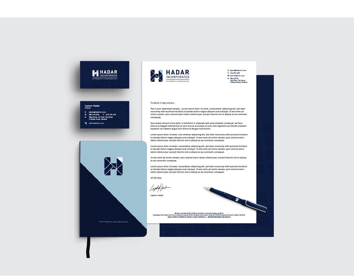
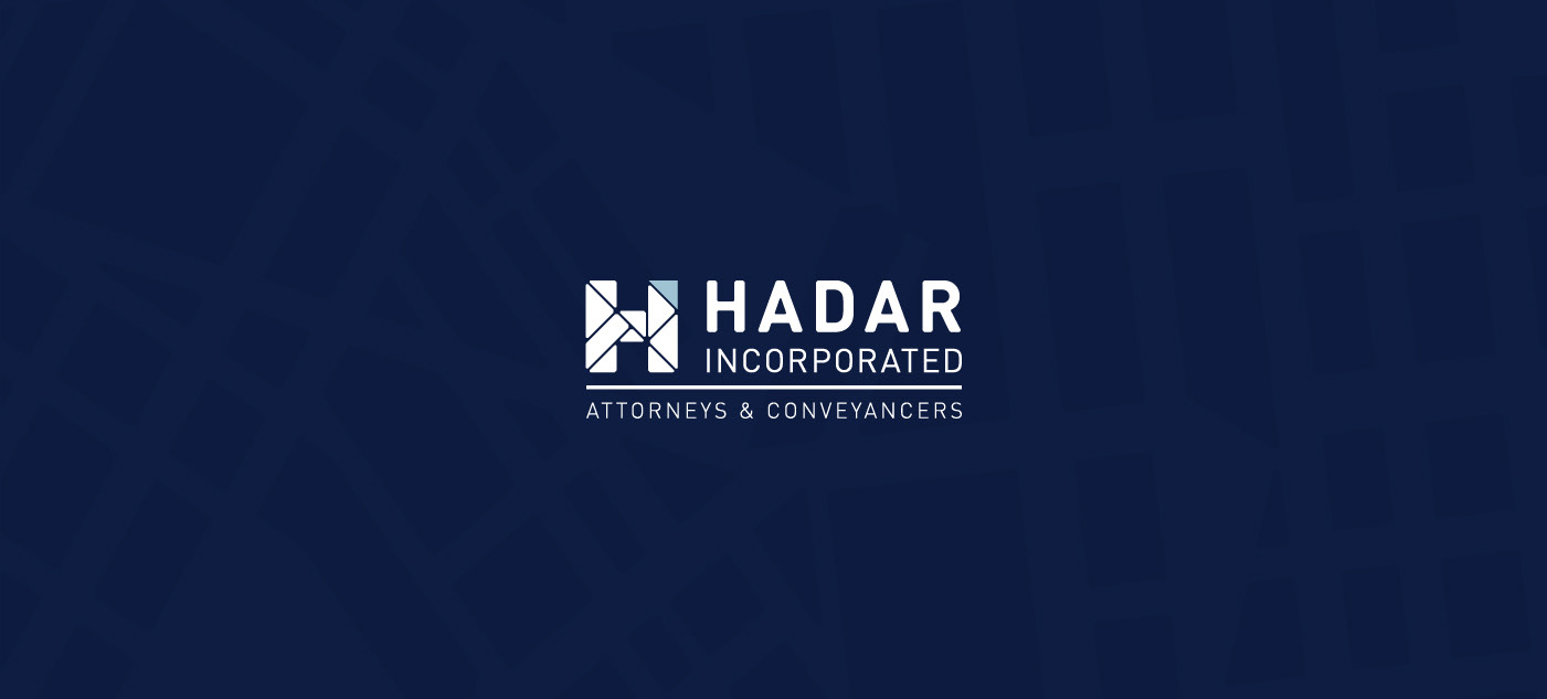
Hadar Incorporated Logo
Property law firm Harris Hadar Incorporated was splitting and Mr. Hadar needed his own identity. More than a logo update, this logo needed to speak for itself and completely outshine the current logo, owning that space in the legal field.
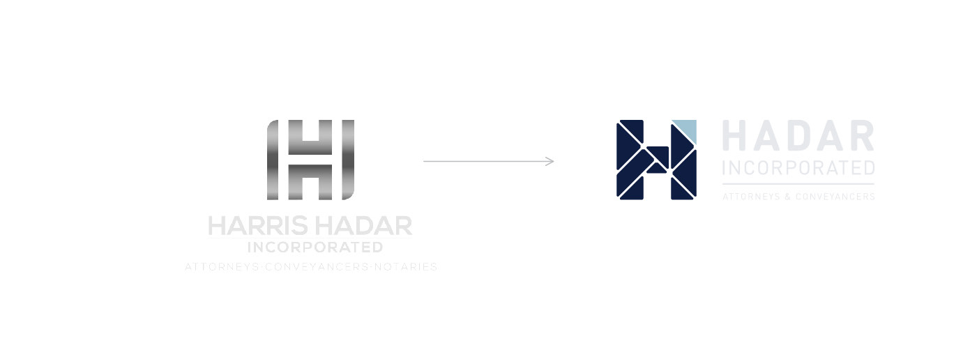
THE SHOWDOWN: Mr. Hadar wanted to again focus on the letter "H", so directly competing with his x-partner.
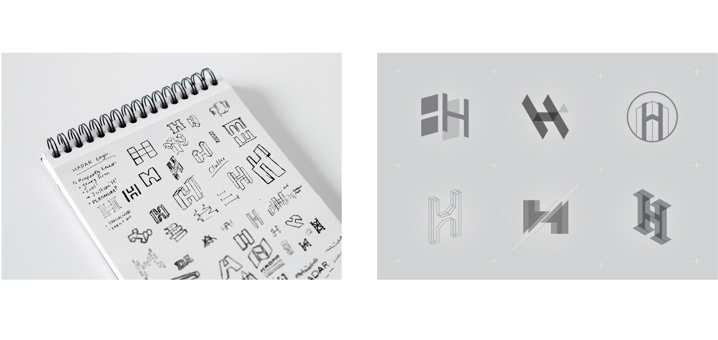
INITIAL PROCESS: After exploring a few property related "H" lettermarks, the city grid plan/system, made famous by ancient Rome, seemed like a great solution to explore. As Hadar Inc. is based in Johannesburg, I began by looking at the initial plans of the city from 1897 for inspiration.
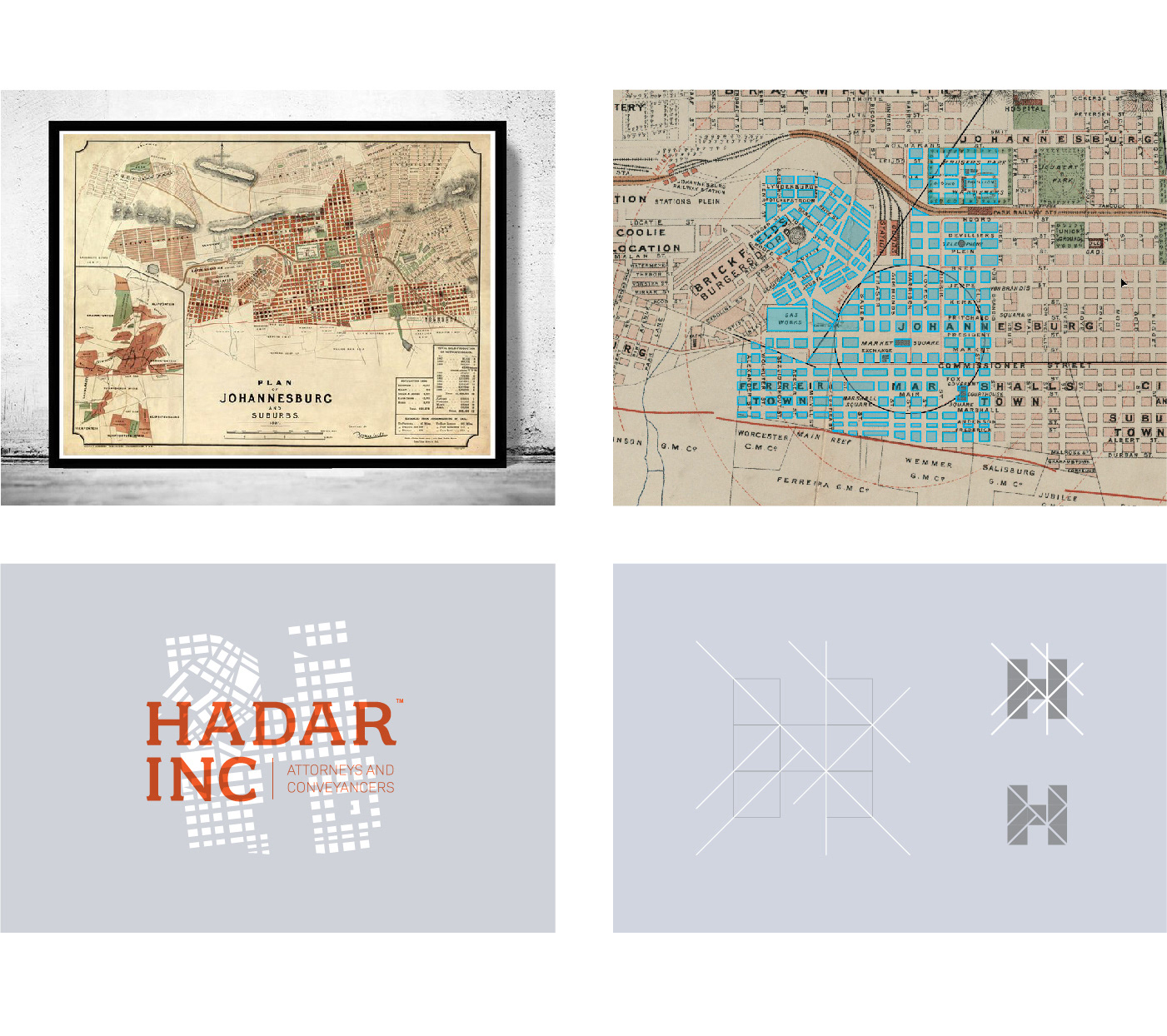
THE PERFECT GRID: Finding the perfect “H” within the Johannesburg grid system was proving a little tricky. So instead, I drew inspiration from the reference and simplified the lettermark.

CORNER RADII & FONT ADJUSTMENTS: Corner radii were adjusted until lettermark felt balanced.
Modified DIN Pro font relative to the corner radii of the lettermark.
Modified DIN Pro font relative to the corner radii of the lettermark.
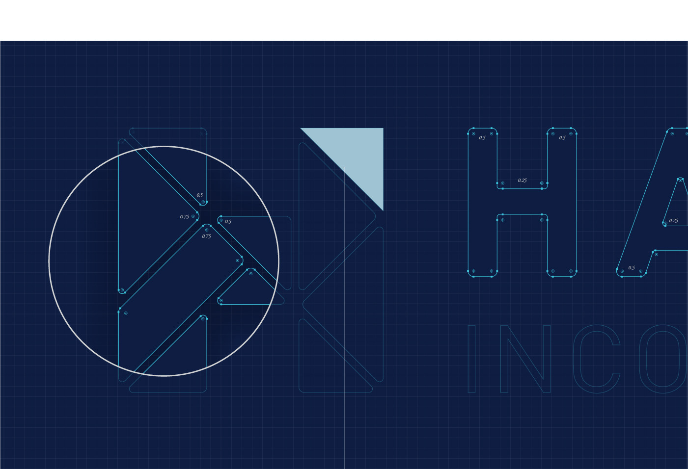

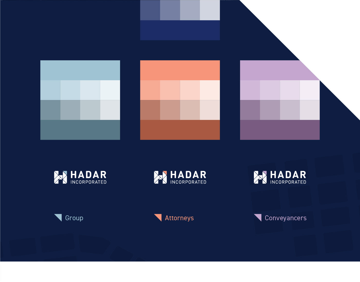
TRIANGLE / CORNER MOTIF: Used with the payoff line and to highlight key points. Triangle represents Hadar’s property connection and steady growth. Also used as a differentiator for each department.
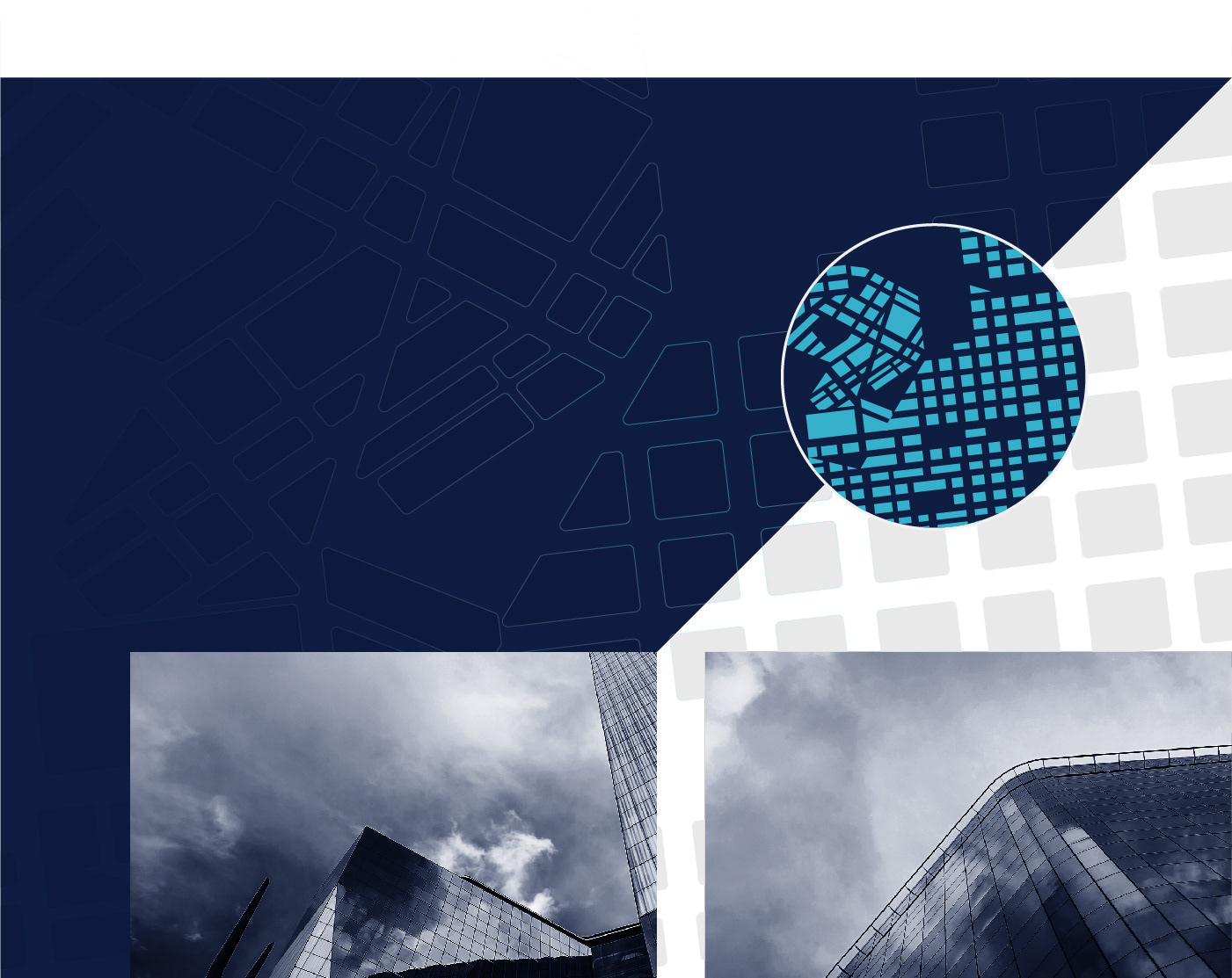
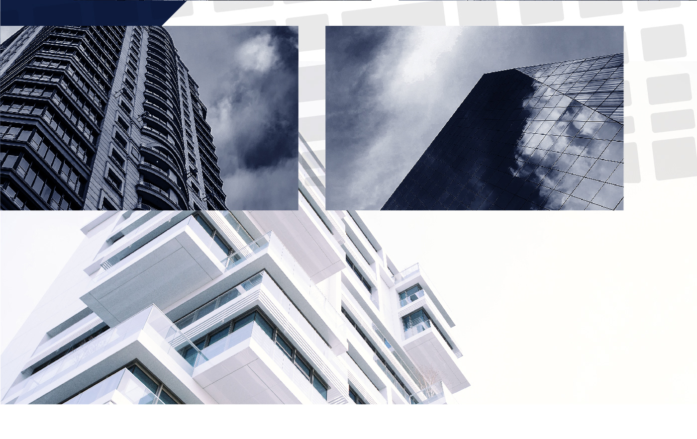
BACKGROUND PATTERN AND PHOTOGRAPHY: Pattern was recycled from the initial city grid plan I traced, using it as a subtle background pattern. Imagery of various buildings, shot from street level with a blue and moody filter.